Case
Hochschulsport Campus Luzern
A brand that moves: identity, a platform for the brand guidelines, an online poster builder and a mobile sports programme – “Study. Meet. Move.”
Password protected
A visual identity with an idea and clear rules: logo system, colours, typography and applications – so the brand works the same everywhere, on screen, on paper and in space.
Corporate design is the set of rules behind a visual identity: logo, colours, typefaces, grid, imagery and how they work together. It makes sure a brand looks the same on the website as in the annual report, on a poster or on a T-shirt.
Consistency is not an end in itself. It makes a brand recognisable.
Everything starts with a core idea: the thought that holds all design decisions together. Symbolism, colours, typography and imagery grow from it – which is why it all fits in the end.
Example TCS “Made Visible”: road safety not as a warning, but as a lifestyle brand. From this idea came the wordmark, a night-time imagery and a poster series that carried new motifs for three years.
I do not develop a single logo but a logo system: base logo, horizontal variant, mini logo, clear space, colours and rules. The mark fits a poster as well as a browser tab.
Example Hochschulsport Campus Luzern: evolution to an italic, dynamic wordmark, strong cyan and the claim “Study. Meet. Move.” – documented in a brand book for web, print and merchandise.
A good corporate design is strict enough for a consistent appearance and open enough for new ideas. Templates and an understandable brand book let the team keep working without a designer – for presentations, social media and publications too.
Elements I work with
and more
Case
A brand that moves: identity, a platform for the brand guidelines, an online poster builder and a mobile sports programme – “Study. Meet. Move.”
Case
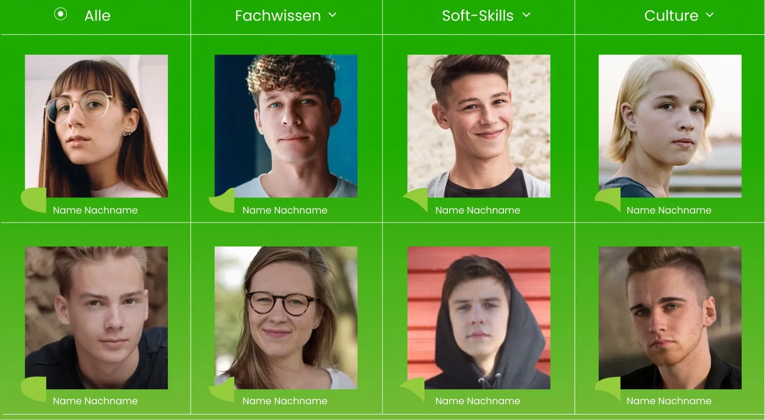
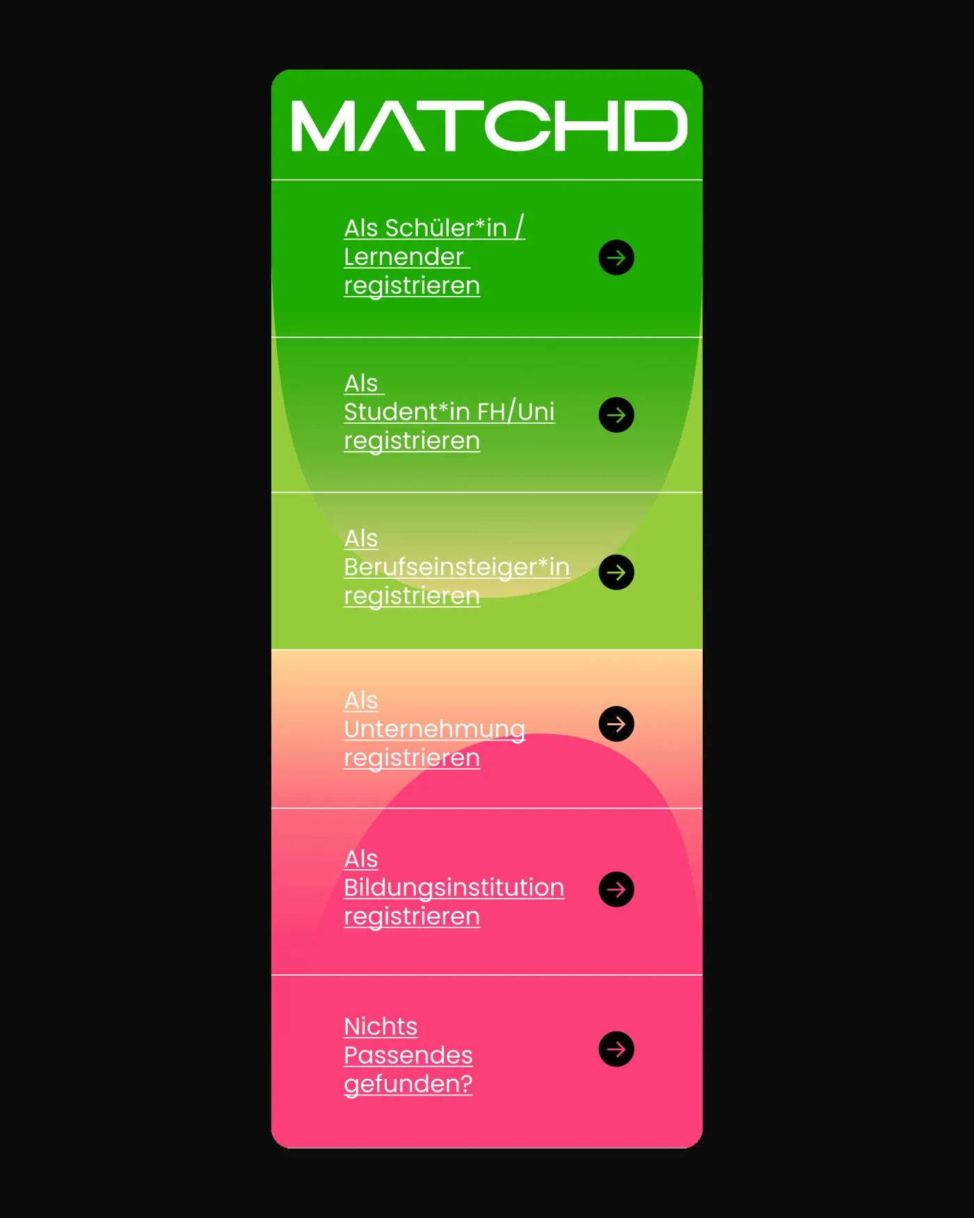
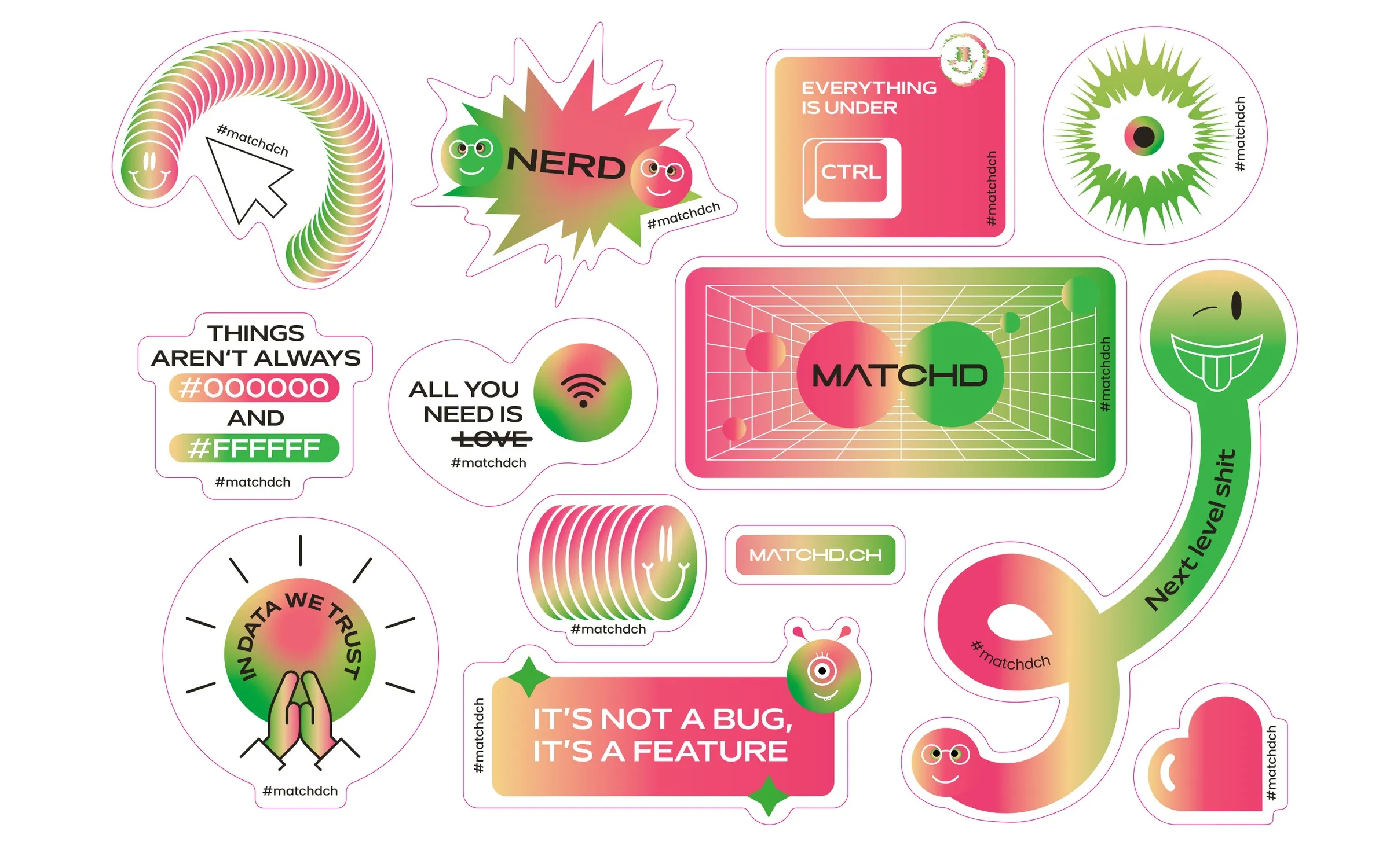
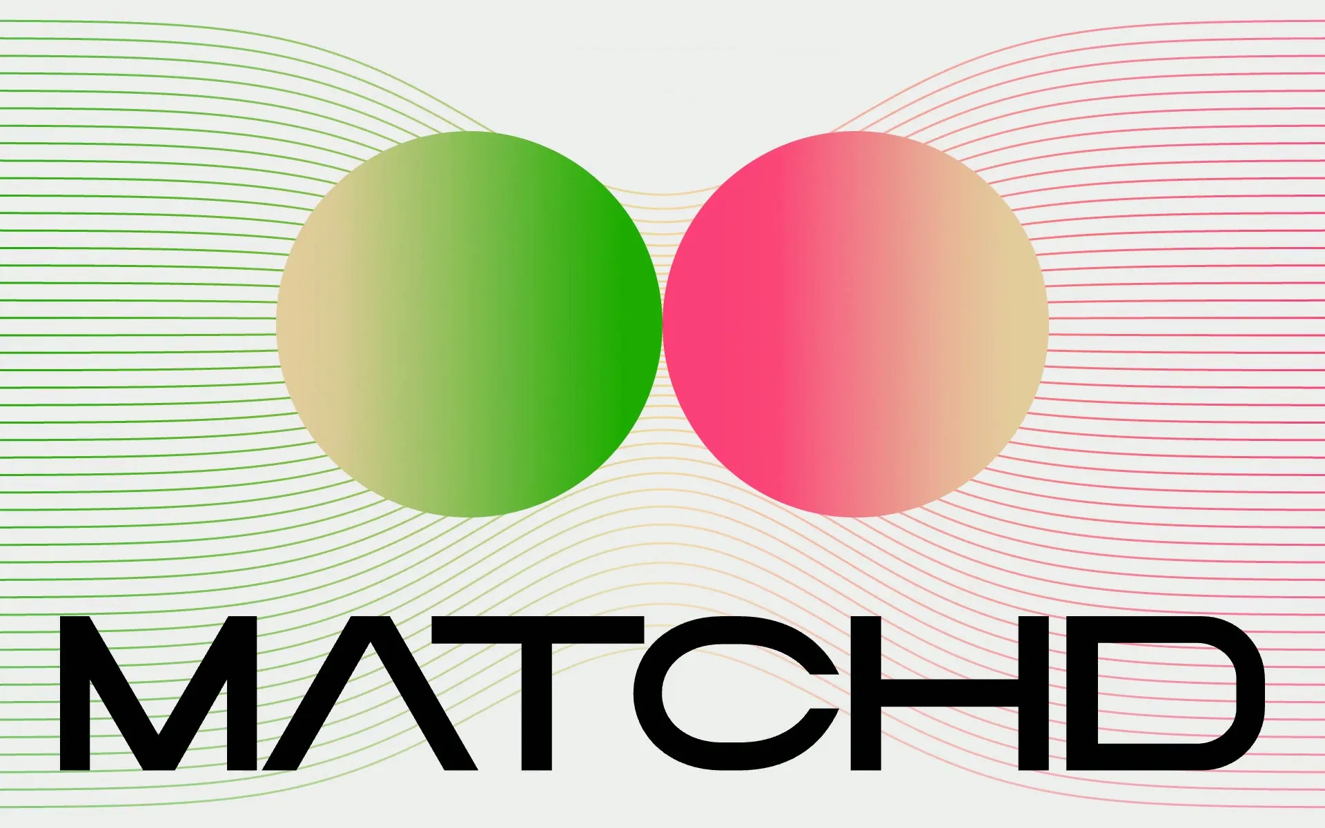
Brand, platform and website bringing young tech talent and progressive IT companies together – designed like a magnetic field.
Case
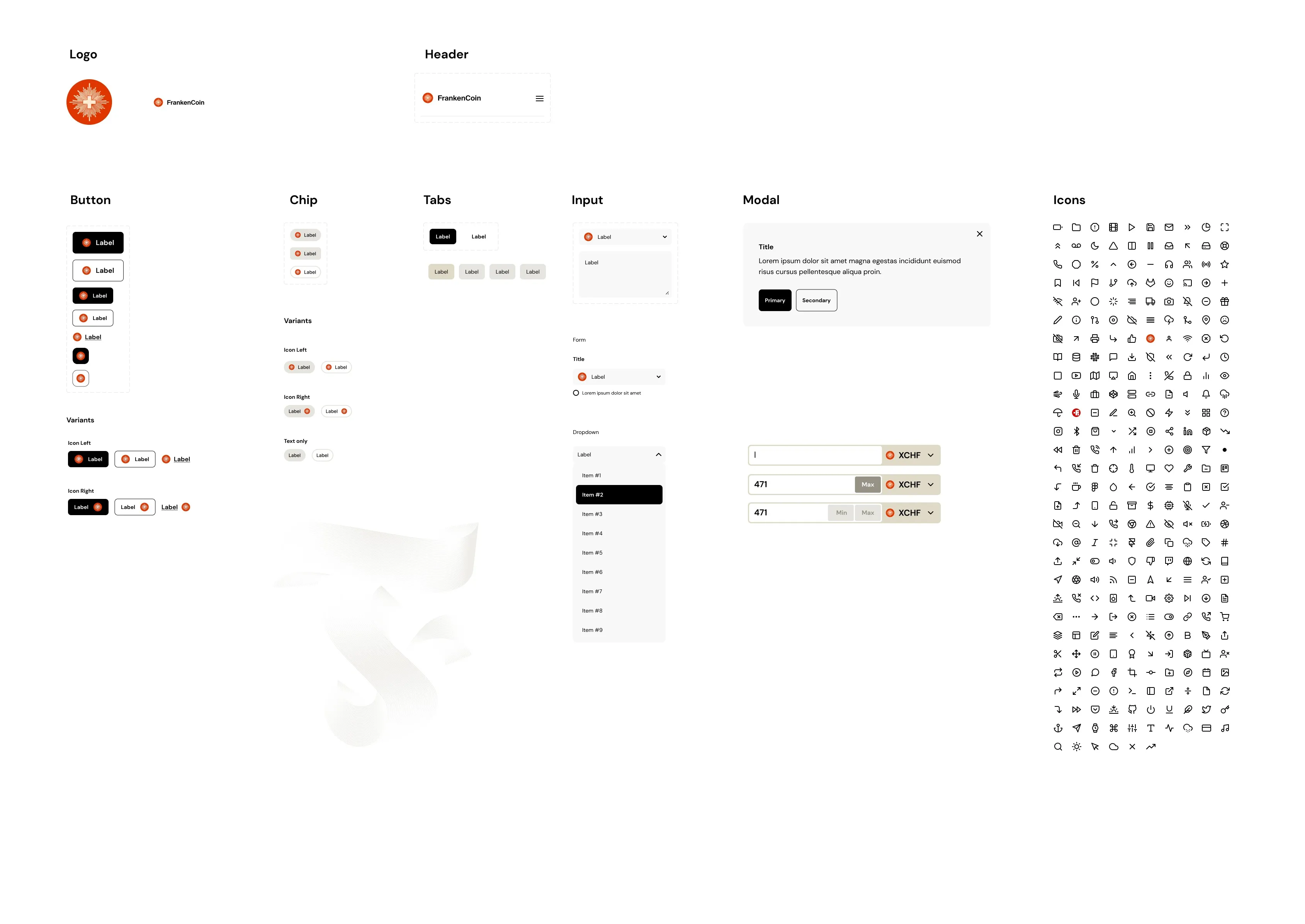
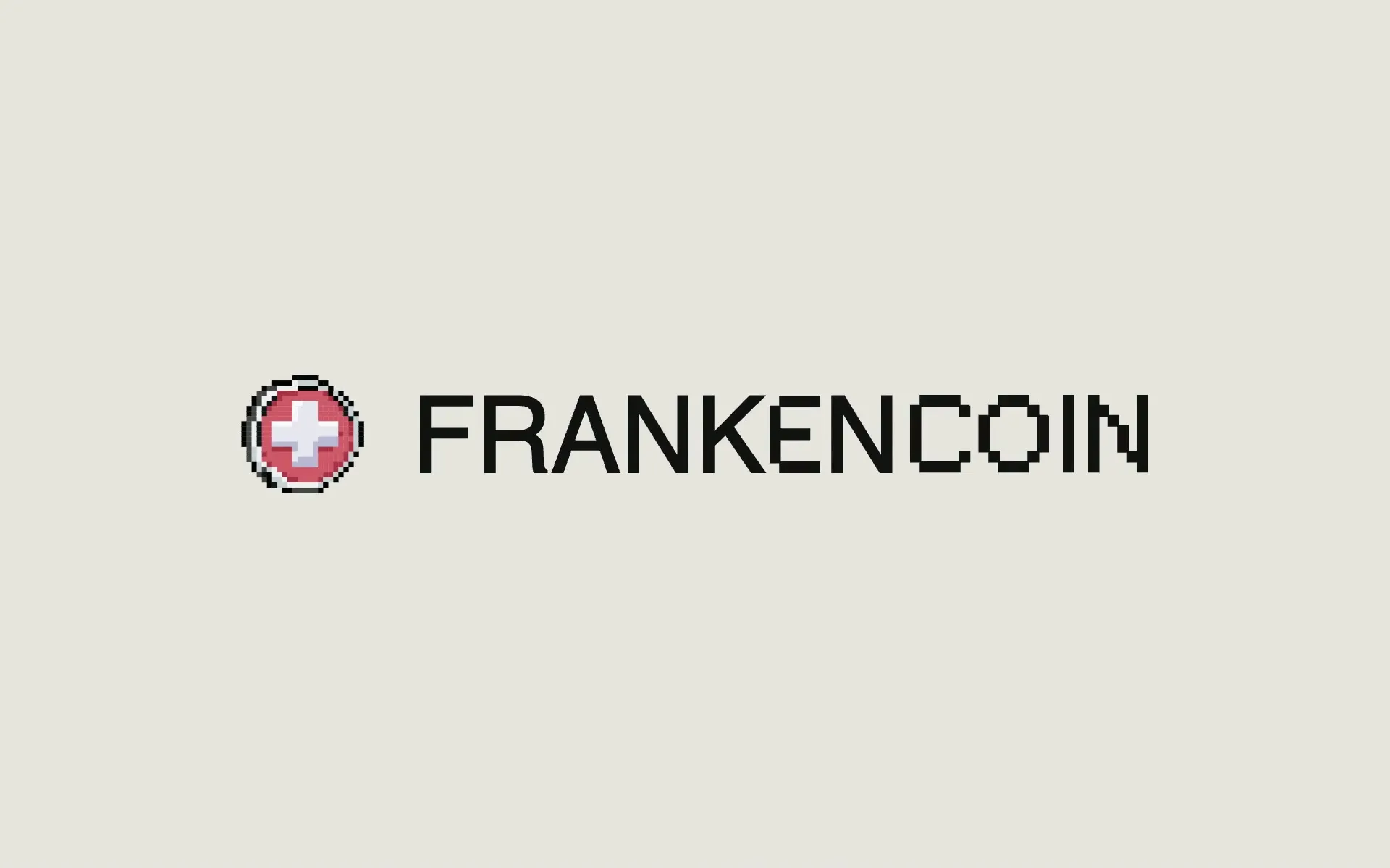
Brand, design system and dApp for the Swiss franc stablecoin: a Swiss cross made of pixels, calm natural tones and clear numbers.
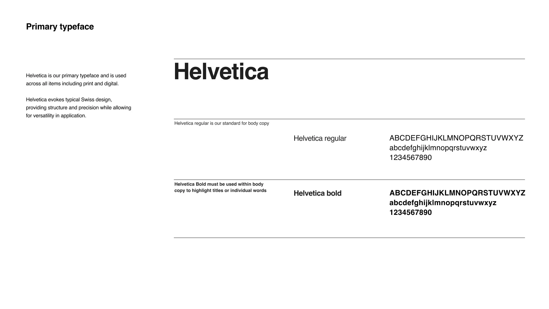
Slides from presentations of these projects
Tell me about your identity: where does it fall short today, and where does it need to work?