Matchd Brand, platform and website bringing young tech talent and progressive IT companies together – designed like a magnetic field.
Matchd brings together what belongs together: young tech talent and smart ICT companies. The platform is run by «IT rockt!» and is part of the Canton of St.Gallen's IT education initiative.
Read moreLess
For Matchd, I designed the brand, platform and website, along with explainer videos, social media content and print materials for fairs. The platform has sections for talent, companies, jobs and projects.
Like a magnet connecting two poles
Idea
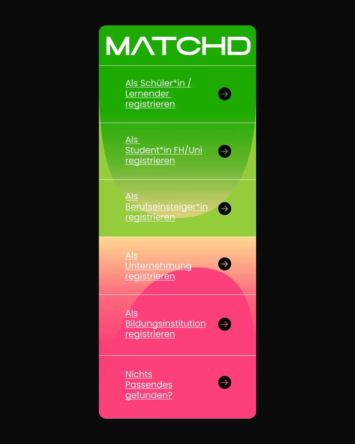
The symbolism of magnetism and gravity underpins the entire design. Talent and companies are the two poles: green for talent, pink for companies, with a gradient in between where they meet. On the homepage they face each other, each with its own entry point.
Every audience has its colour
Sections
Talent sits on green, companies on pink, jobs on orange, events on black. This makes it clear on every page where you are, and the brand's colour system carries through to lists and profiles.
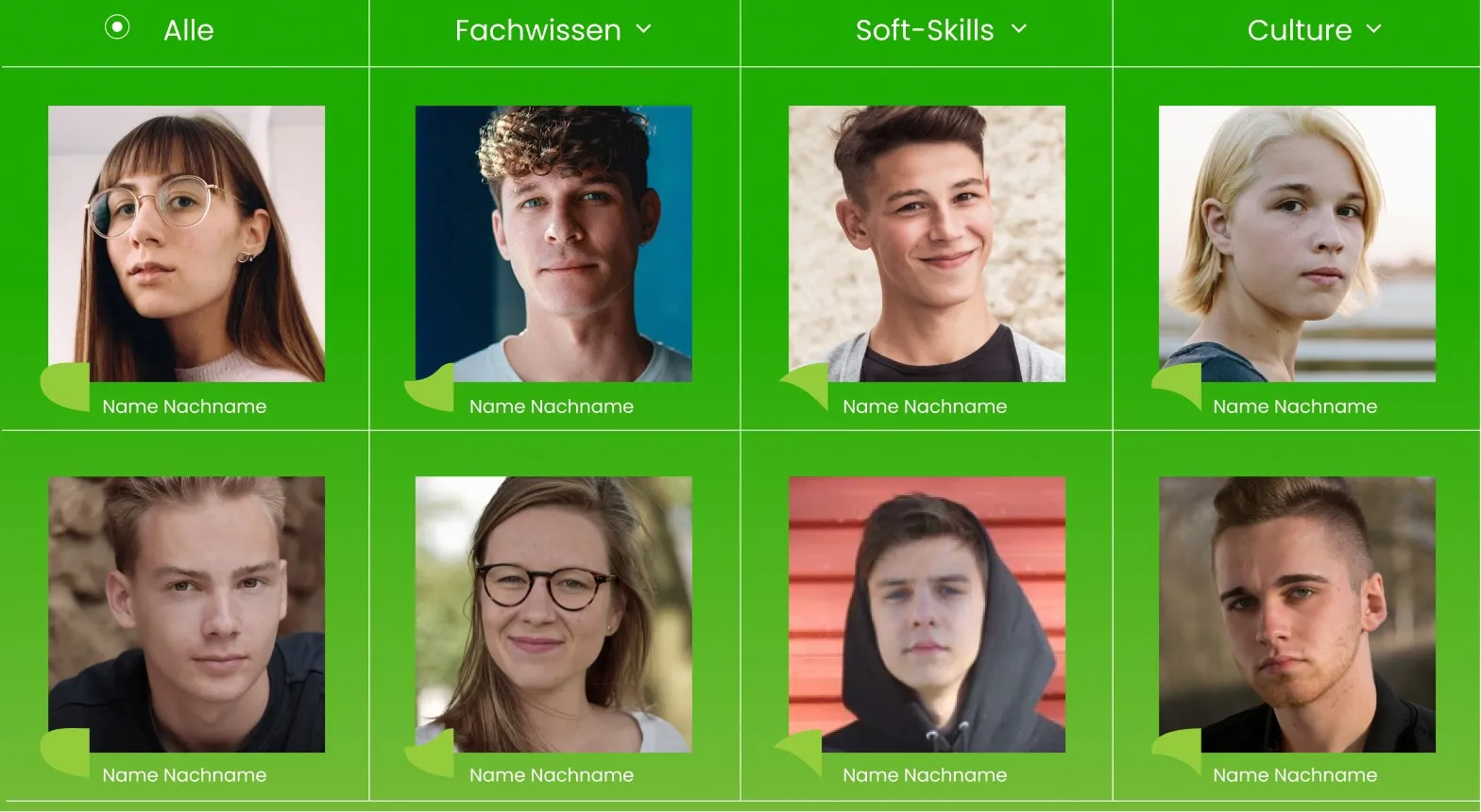
Culture counts as much as skills
Culture
Companies describe themselves on four sliders: trendy or timeless, hierarchical or holacratic, stable or constantly changing, informal or formal. Talent states what matters to them. This creates the common ground that counts in matching.
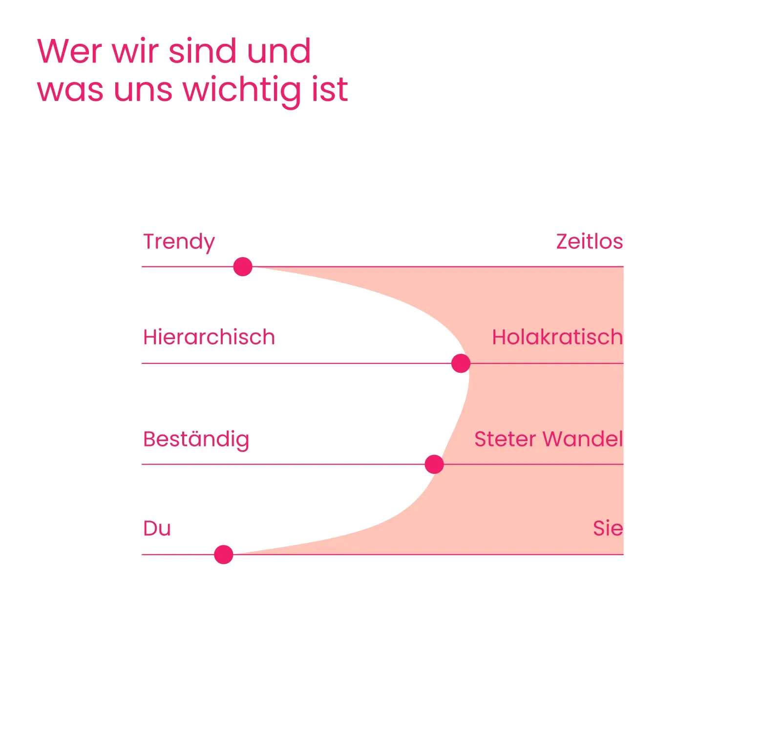
A match takes both sides
Matching
Companies see suitable talent as dots around their job: the closer, the better the match. Two sliders weight common ground and technical skills. Showing interest sends a request. Only when the talent agrees is it a match, and both receive a confirmation.
A brand you stick on your laptop
Community
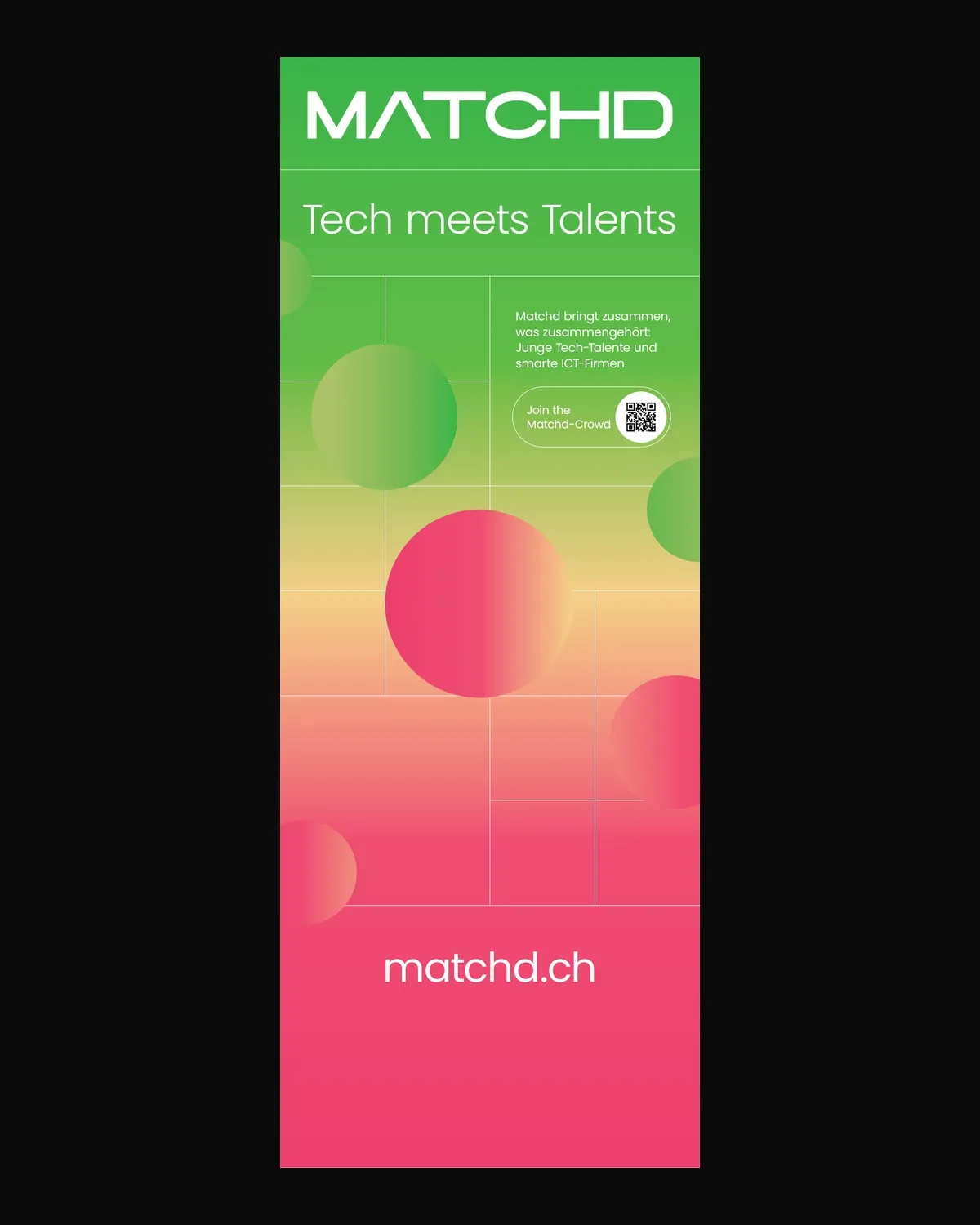
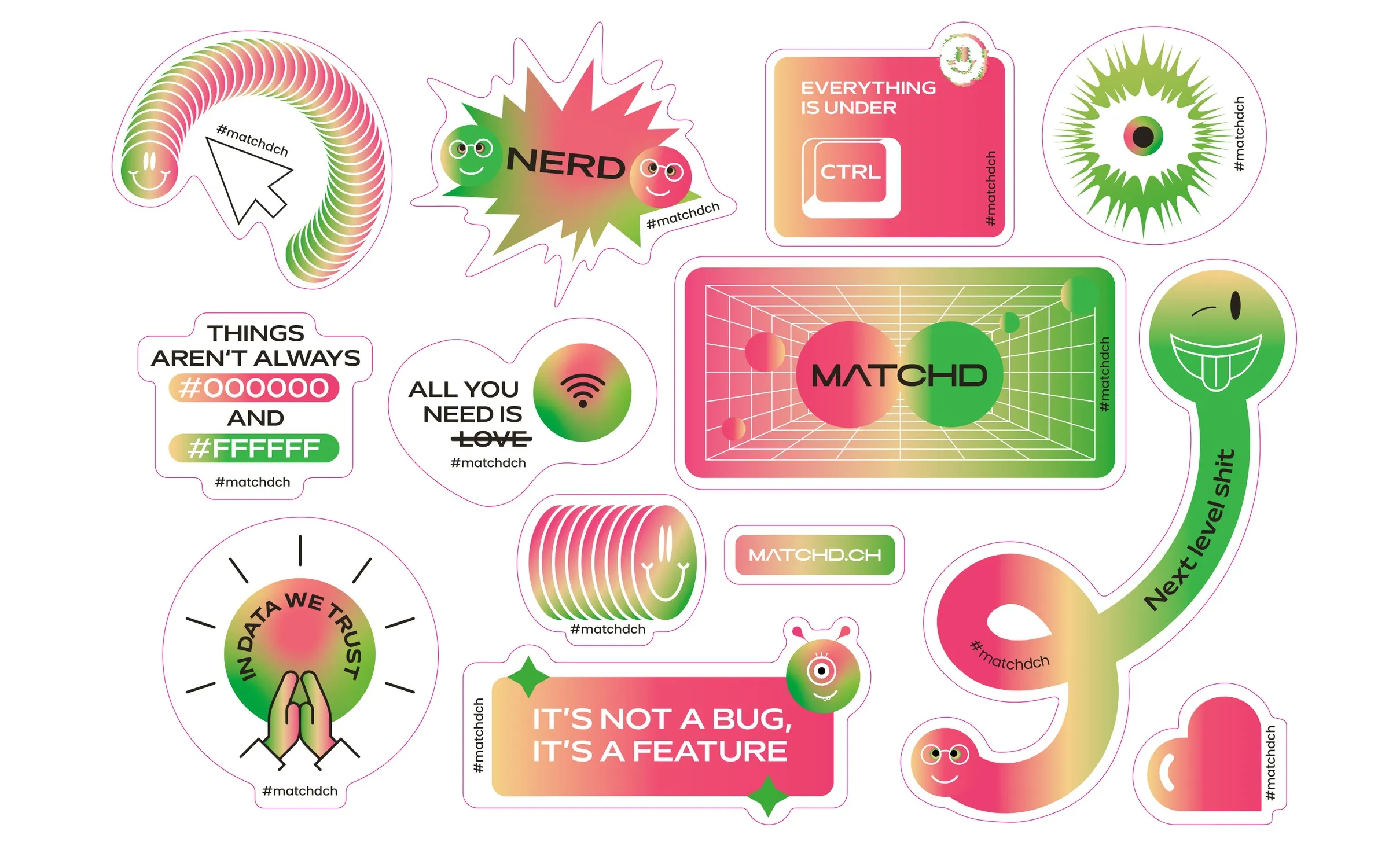
Matchd was meant to feel like a community, not a job board. So I made stickers with nerdy humour, stories tackling the skills shortage and roll-ups for fairs and schools. The two poles and the gradient carry through every format.
Six videos instead of a manual
Explainer videos
Signing up, creating a profile, posting a job or project, matching: each step has a short video. It shows the real platform click by click, framed by the brand's gradient.
Launched as an MVP, grown into a community
Impact
Matchd went live in July 2021 as a deliberately lean first version. Around 70 young ICT talents joined the community within a short time, and companies in the region could approach them directly.