Excellence Cruises A website that lets you feel a river cruise before you book it: from the brand core and three navigation routes to a home page in motion.
With Liip, I designed the new website for the Swiss river cruise company Excellence: from an inventory of all content to personas, three navigation routes and a home page in motion. The guideline for everything: tell a story instead of listing, so a river cruise can be felt before it is booked.
A large offer that was only listed
Starting point
Excellence sails its own boutique ships through Europe: a Swiss family-owned company, outstanding food, experiences ashore. My first step was to collect and sort all content: what is essential, what carries the brand, which types of trip, themes and rivers guests start from, and what events and campaigns need.
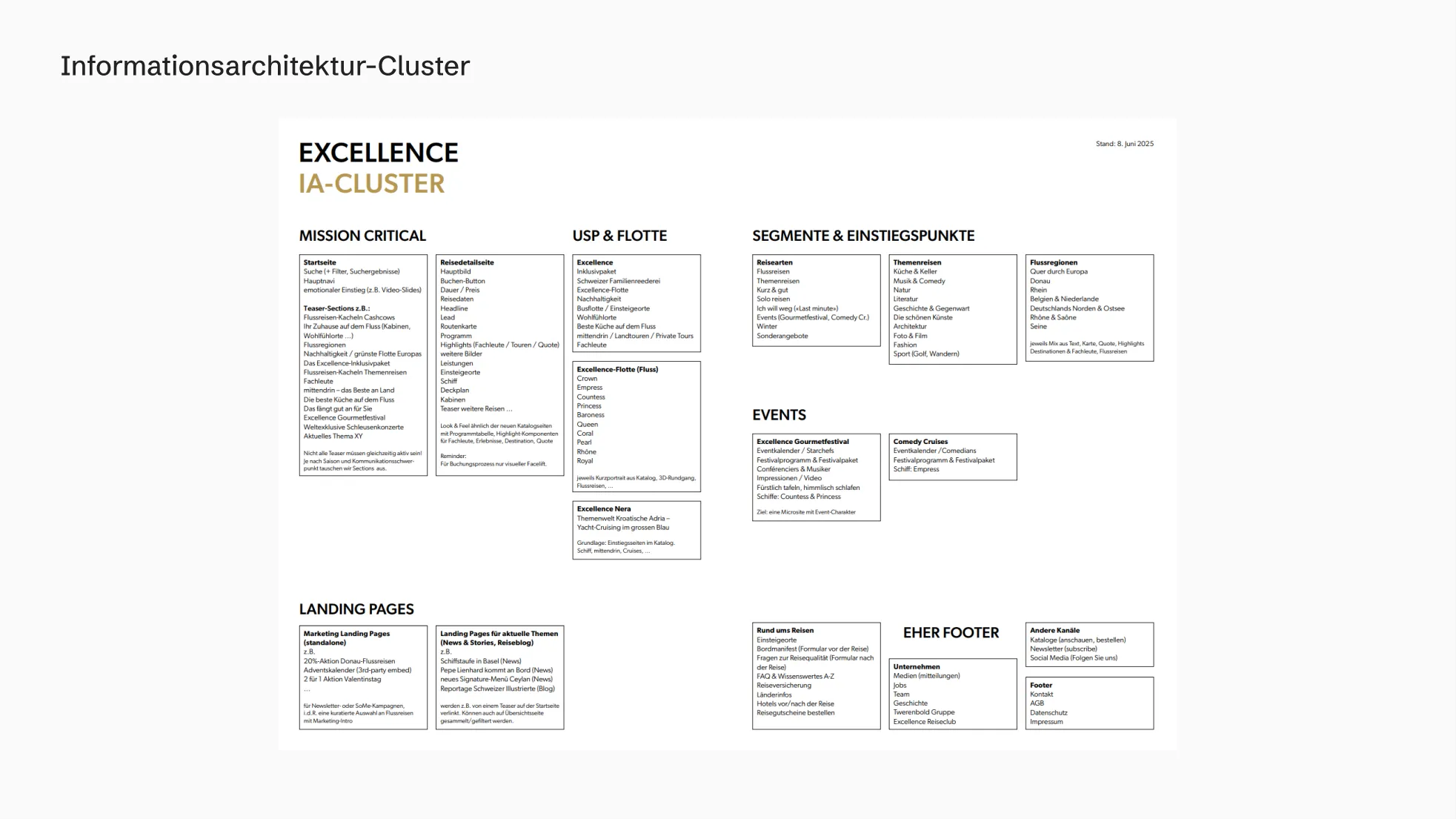
With a neutral website, Excellence would be one of many
Insight
The offer was complete, but it didn't feel like anything. What sets Excellence apart on board did not come across online. This became the guideline for everything that followed: an information architecture that tells a story instead of listing.
“Without emotional staging, we give away our lead.”
Three guests, three questions
Guests
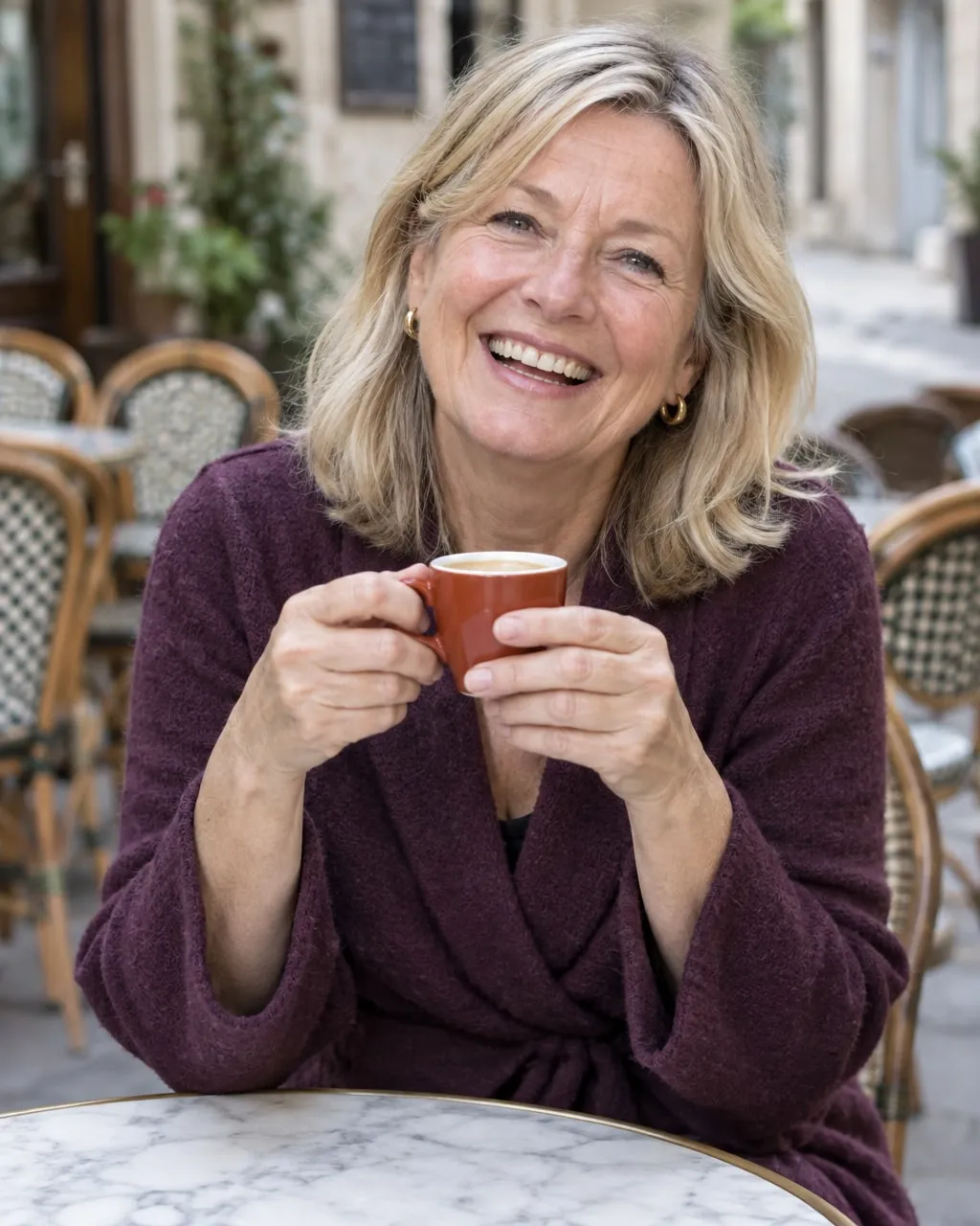
The baby boomer asks “What moves me?”, the experience seeker “Where is it happening?”, the repeater “What’s new at Excellence?”. Every idea was measured against these three questions, from dreaming and comparing to booking.
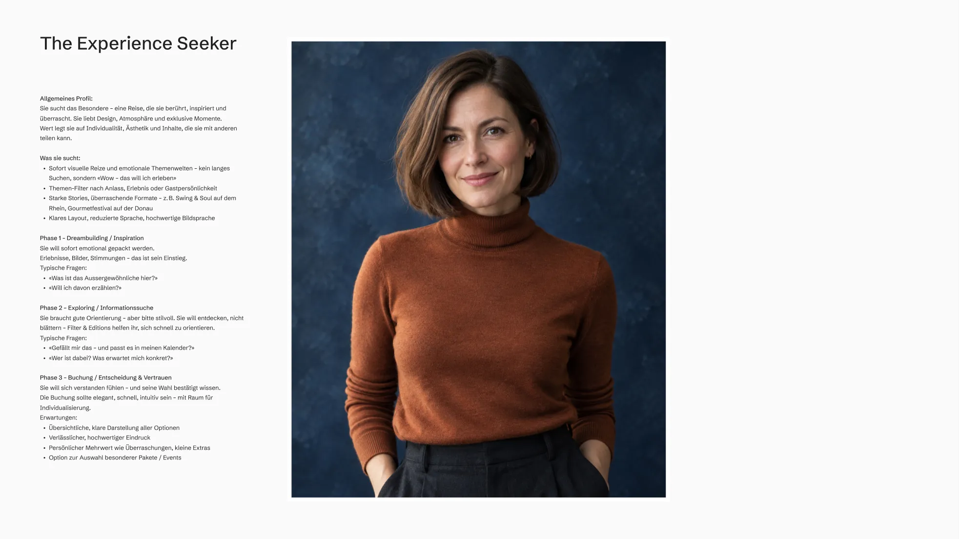
Baby boomer
“What moves me?”

The experience seeker
“Where is it happening?”
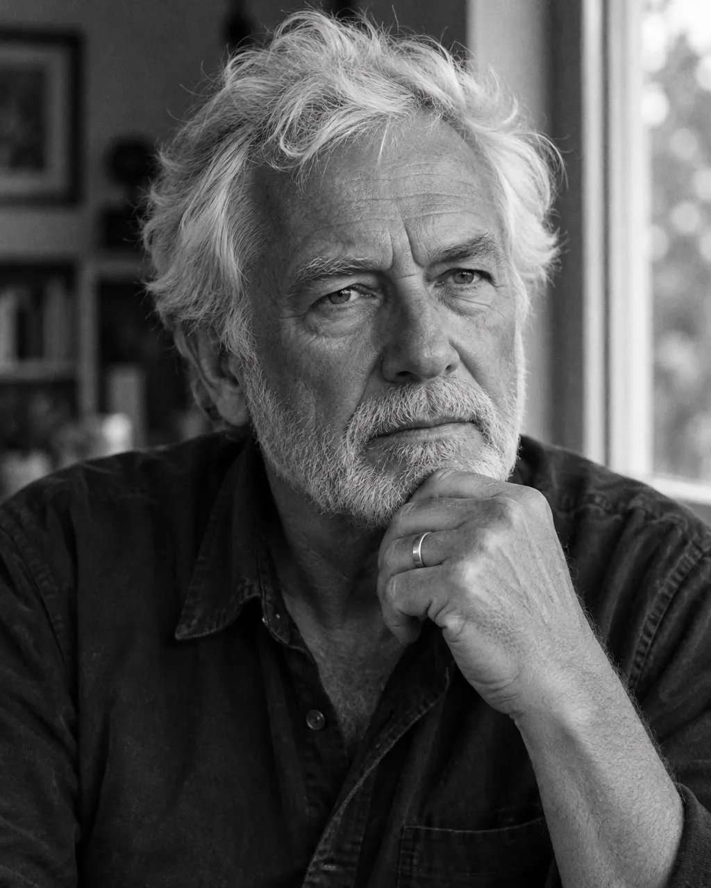
The repeater
“What’s new at Excellence?”
Tell or sell? Three answers to choose from
Three routes
“With all senses” is organised around experience and inspiration, “The best on board & ashore” combines emotion and sales, “Search. Find. Set off.” is all about booking. I recommended route 1, complemented by filters, search and clear entry points.
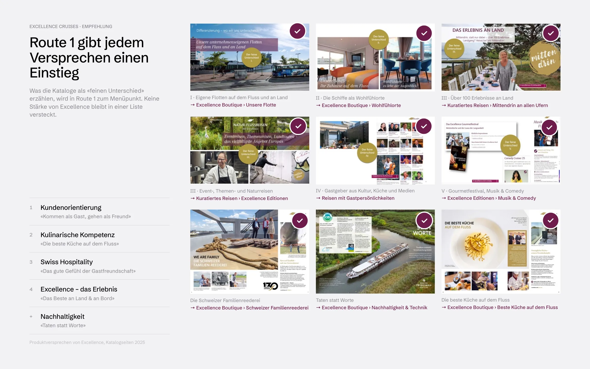
Five pillars become four entry points
Decision
Together with Excellence, we condensed route 1. The experience logic stayed, the navigation got shorter: themed cruises under Cruises, the rivers under Destinations, “Mittendrin – the best ashore” under Experiences & encounters, the ships under Fleet. The menu shows themed worlds with images: targeted search and free browsing in one.
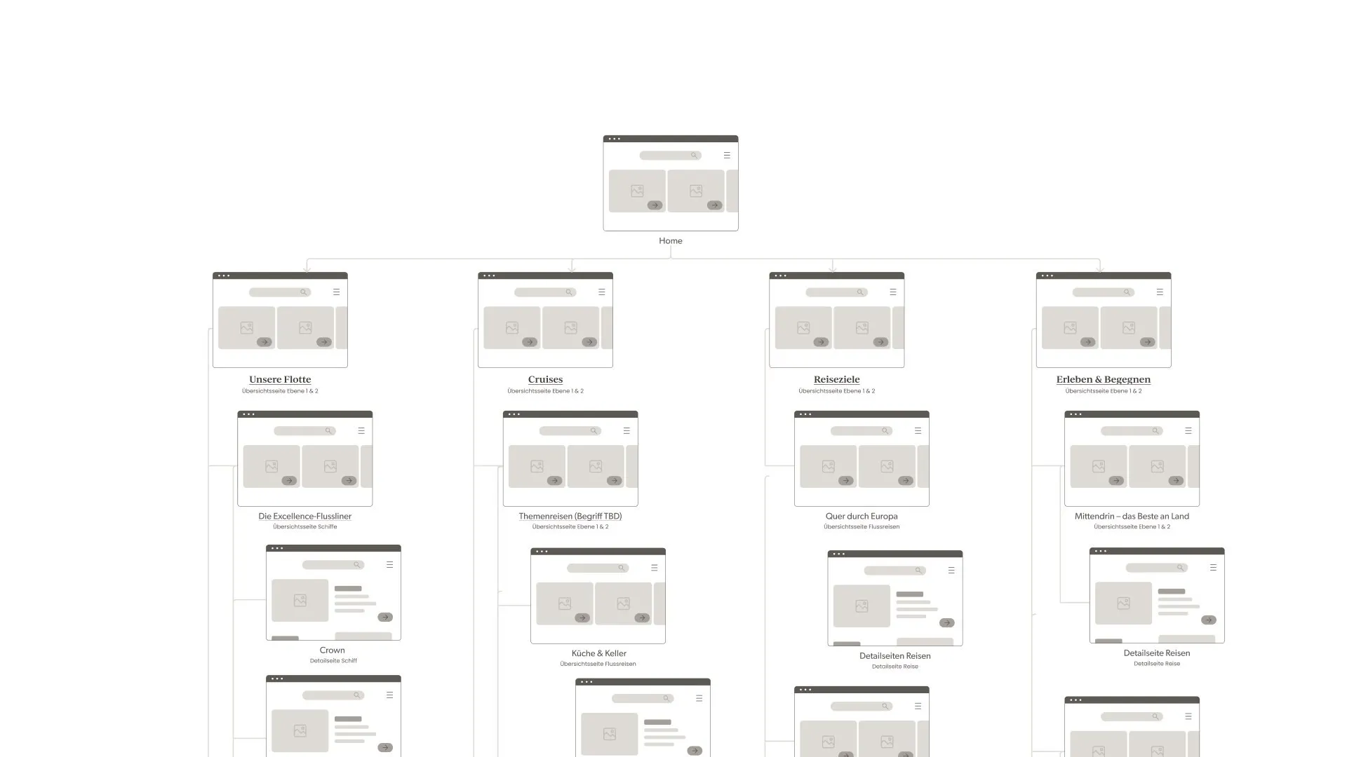
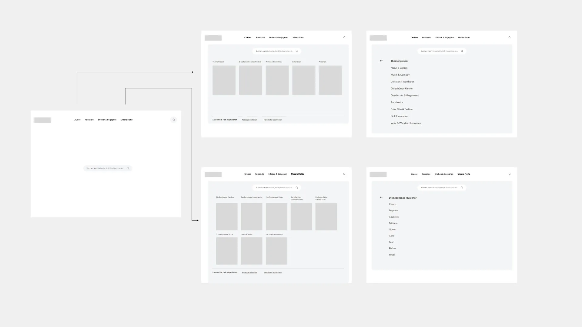
Mood first, then orientation
Home page
The home page follows the guests’ journey: from the moving header with trip search to “Rediscover Europe”, top cruises, city trips and gourmet river cruises. The camera takes the guests’ view: the wake, light on the river, the kitchen in action.
Two directions for the trip to the Iron Gates
Trip page
For the page of a single trip I designed two directions. At the top, a fixed sidebar leads through programme, expert guides, services, ship and prices, with large images alongside. Below, a moving header with the destination opens the page, followed by navigation to the sections and the trip's key message.
From insight to prototype
Result
I handed over a content inventory, personas, three navigation routes with a recommendation, the sitemap condensed together with the client, wireframes, design moods and a home page prototype with moving image. It defines how Excellence should feel online before a single line of code is written.
How it was made
1
Inventory
All content collected and sorted: what carries the brand, how guests enter, what campaigns need.
2
Personas
Three guest types with questions, paths and expectations, the yardstick for every decision afterwards.
3
Three routes
Three navigation routes played through as variants: by trip type, by theme, by river.
4
Decision
One recommendation with reasoning, reviewed together with Liip and the client.
5
Result
Sitemap, wireframes, design moods and the moving home page as a prototype.