Museum für Gestaltung Zürich Concept and design for the new website: the exhibition poster takes centre stage.
The Museum für Gestaltung Zürich runs more than twelve exhibitions a year across ten spaces at three locations: Ausstellungsstrasse, Toni-Areal and Pavillon Le Corbusier. On the existing website, the two most important pieces of information – current exhibitions and opening hours – were hard to find, especially for visitors arriving straight from a search engine.
Read moreLess
Many visitors barely knew about guided tours, workshops and events. The core brief for the new website: accessibility, inclusion and cultural participation. The work covered grid studies, variants for the homepage and exhibition pages, interactions (hover, click, transition to the detail page) and a clickable prototype.
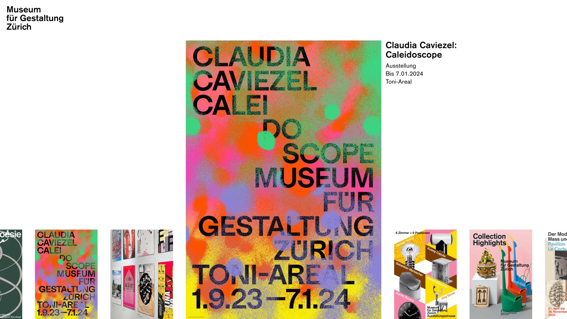
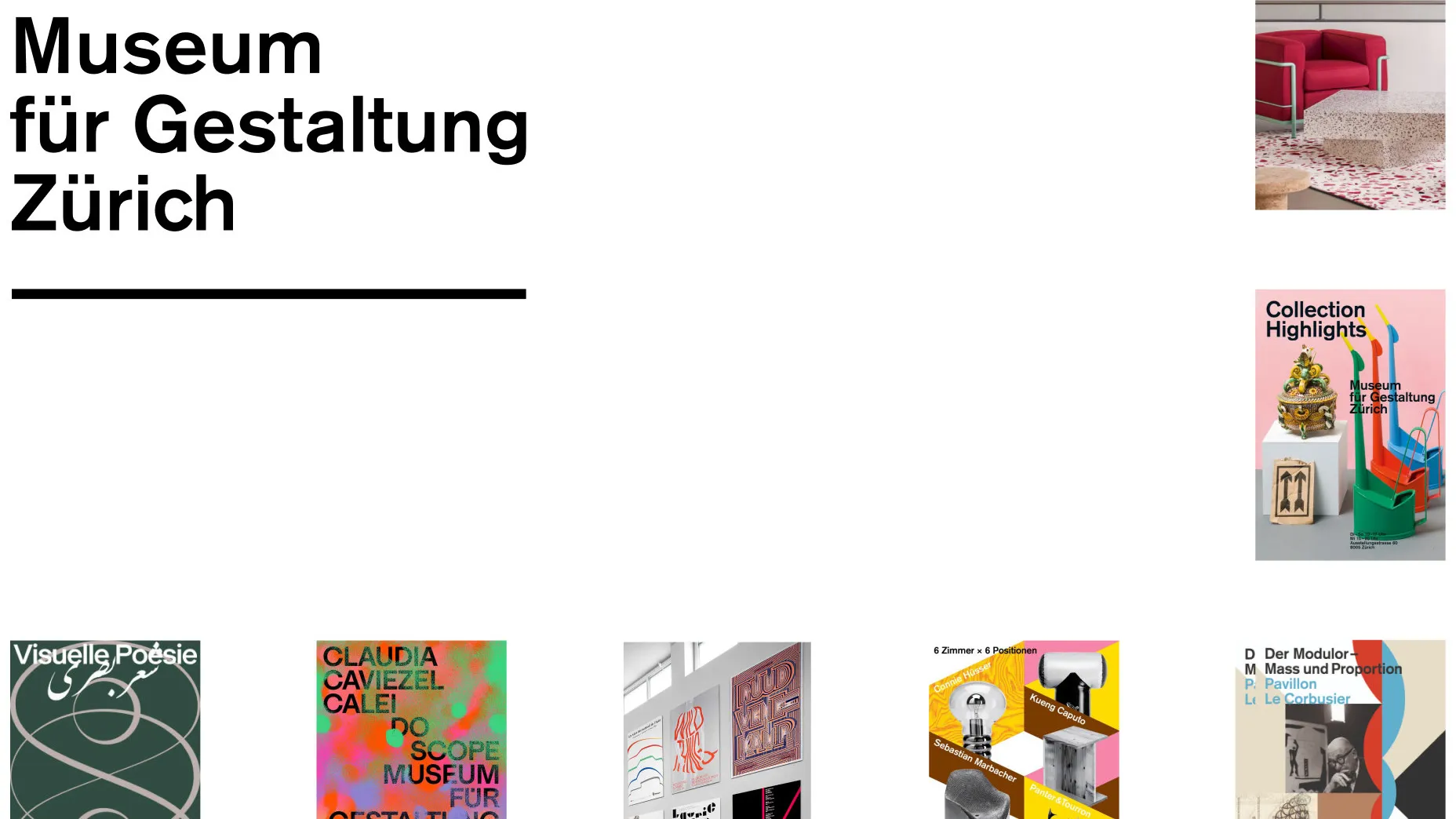
The poster takes centre stage
Poster strategy
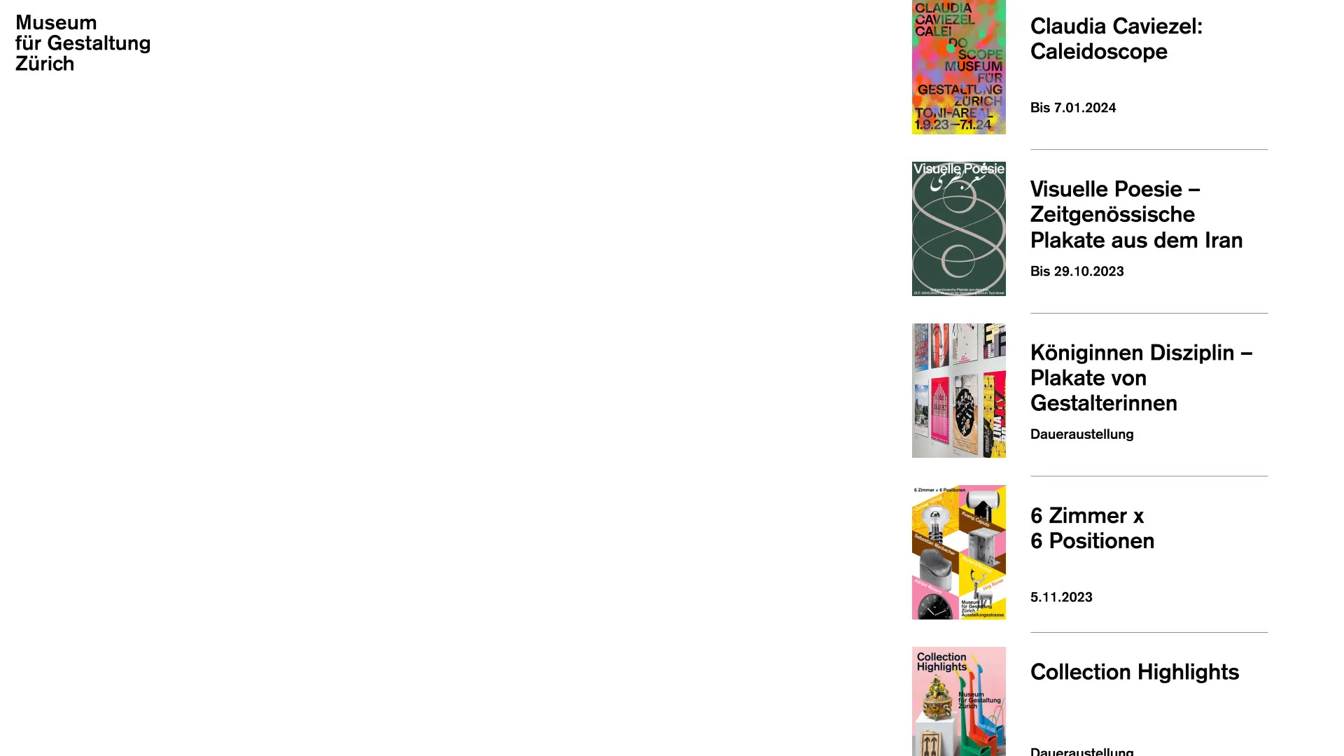
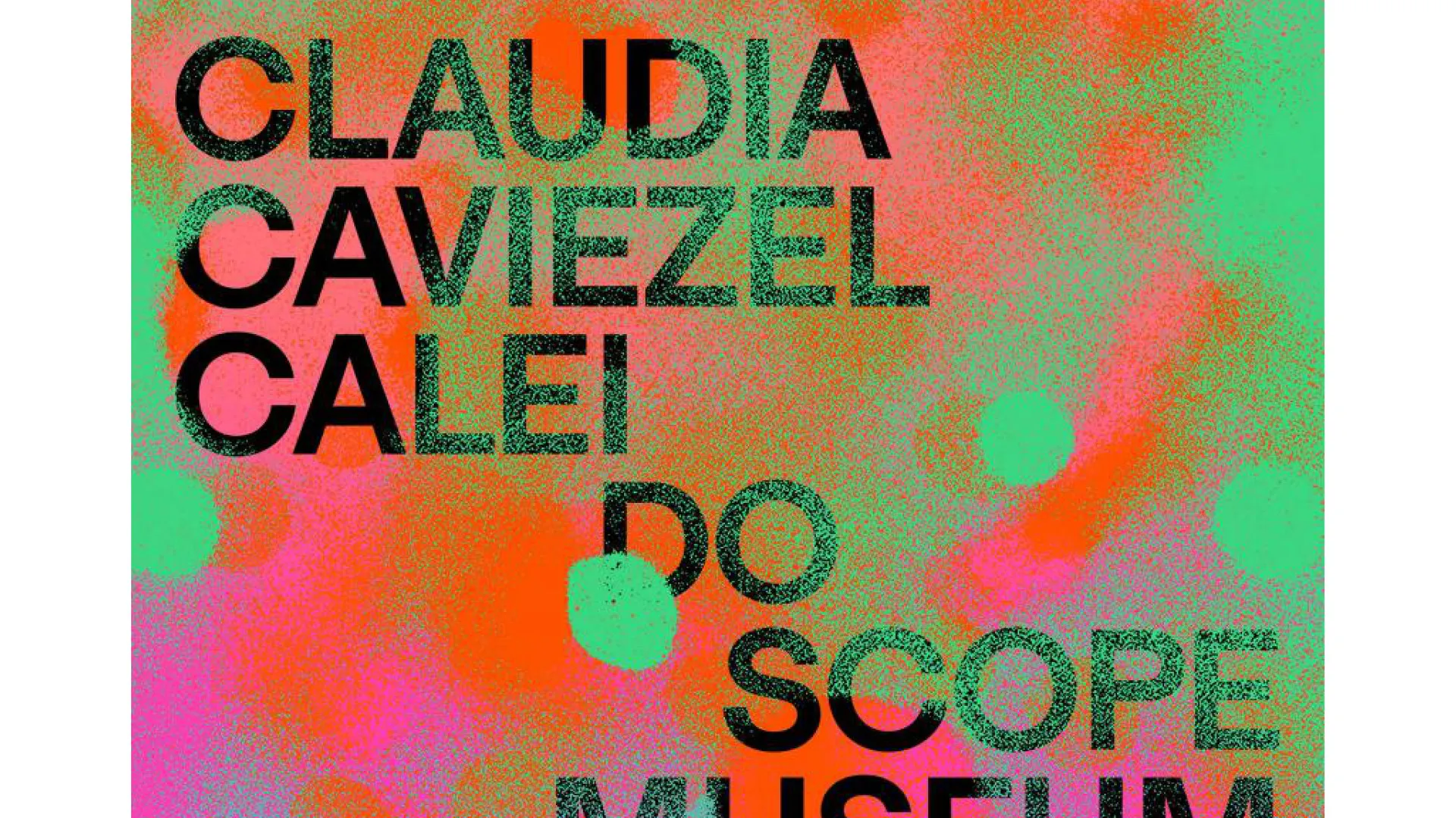
For every exhibition, external graphic designers create a poster – the museum's “poster strategy”. The concept makes this poster the lead character of the website, bridging the street and the screen. Posters already animated for the exhibition trailers are used on the website.
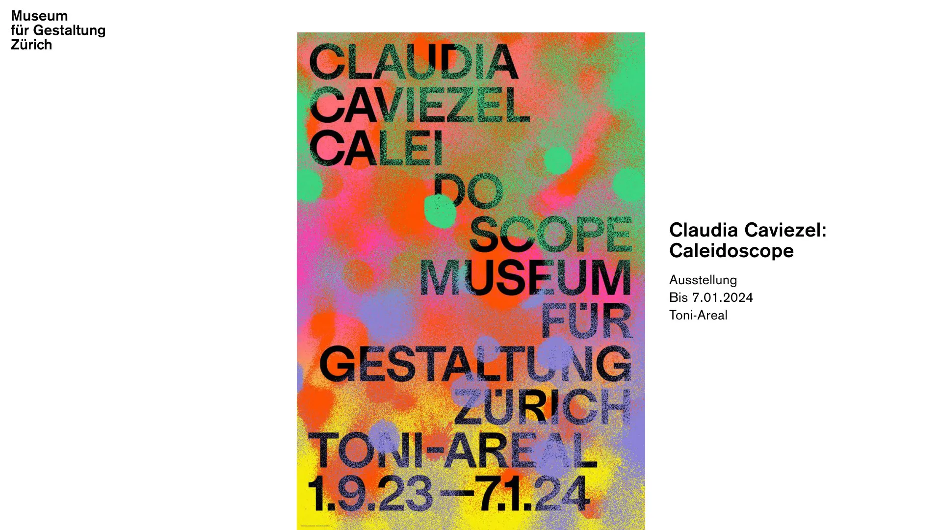
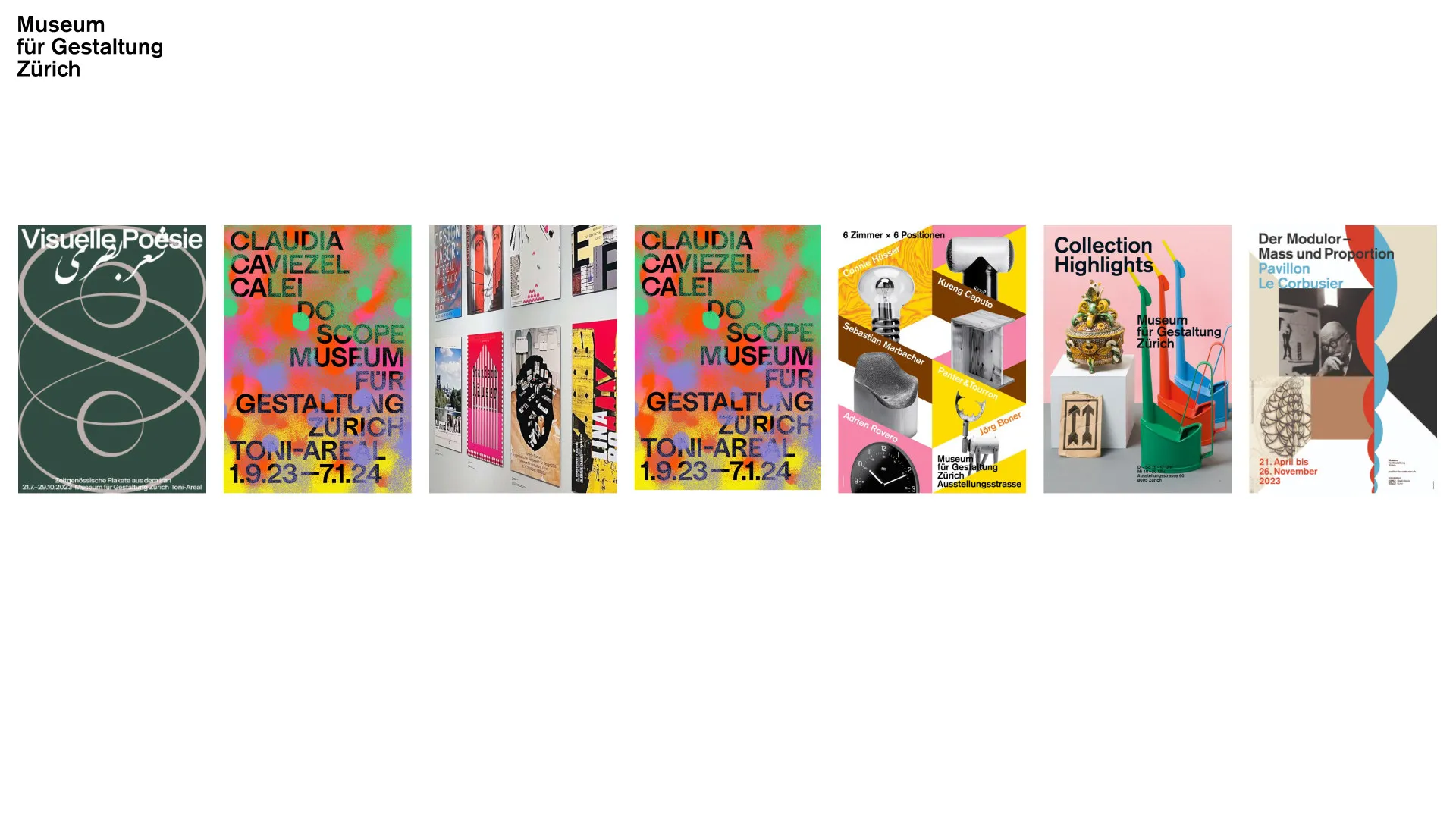
All current exhibitions at a glance
Homepage
Current exhibitions appear as a row of posters right on the homepage, with dates and location. Exhibitions can be swiped through like a poster wall.
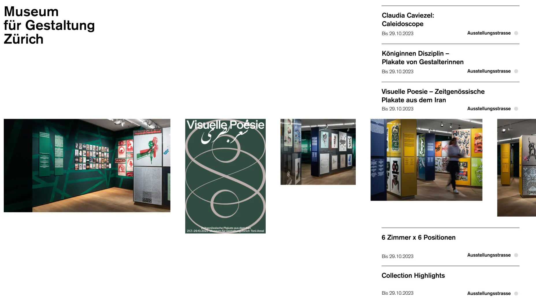
Explore first, then the essentials
Exhibition page
Each exhibition page separates a zone for exploring from a zone with the key information. Posters can be zoomed, unrolled and explored in detail.
Prototype
Klickbarer Prototyp der Website
Loads the interactive prototype from figma.com. Data is sent to Figma.
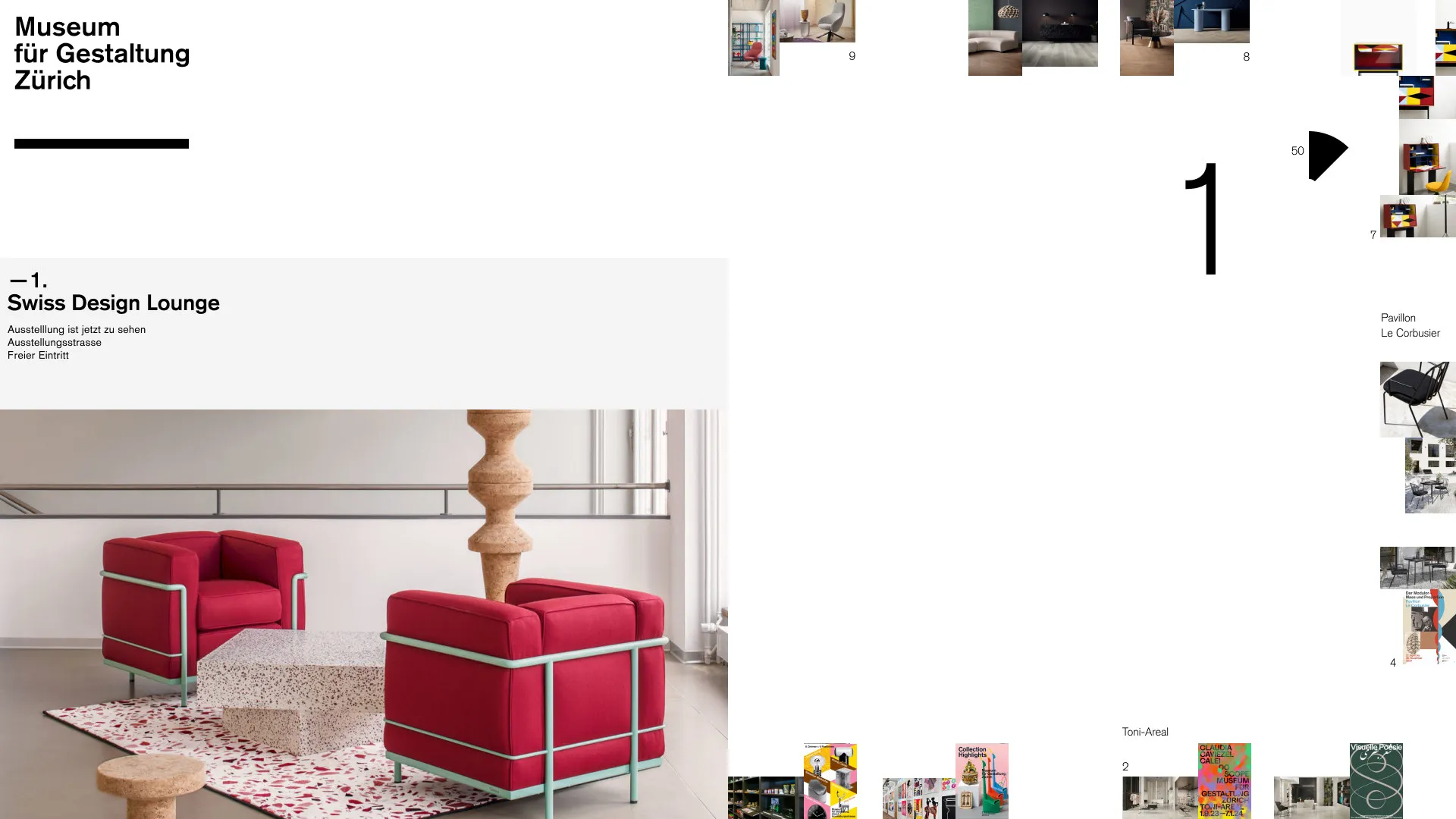
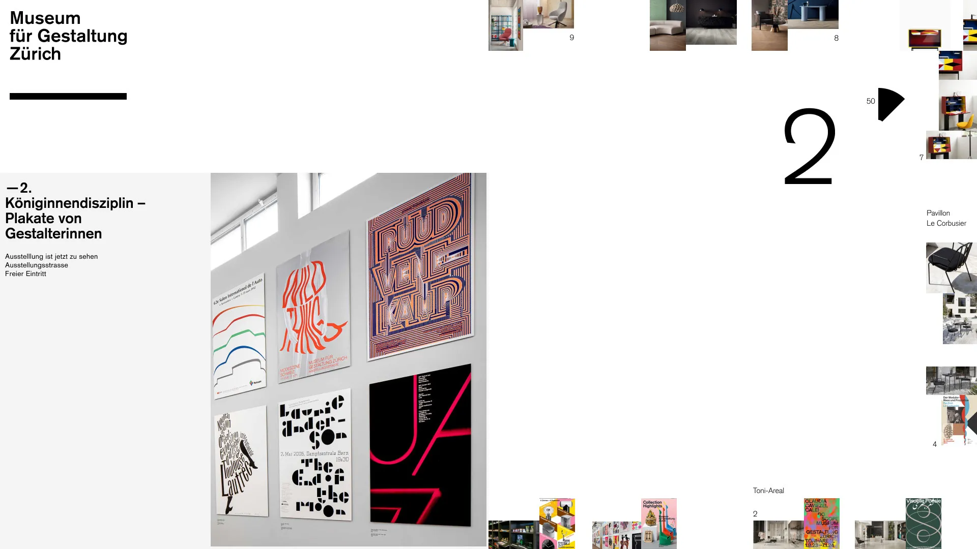
From a single poster to the full overview
Scale
A further idea: pinching and pulling changes the scale of the website – from a single poster to an overview of all exhibitions.